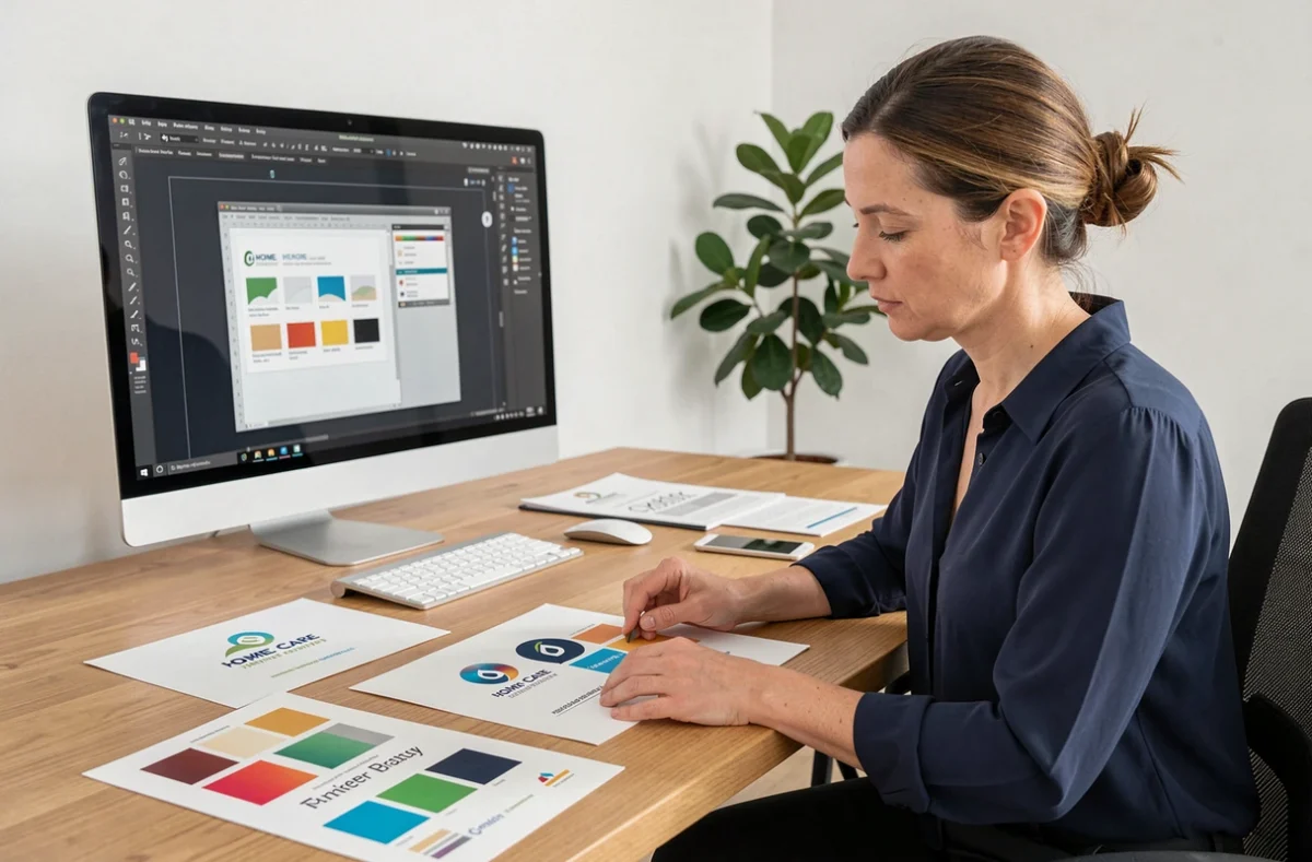
A logo intended for personal services does not function like a logo for a business or a tech startup. The sector imposes specific regulatory constraints, a requirement to integrate the official SAP visual on certain materials, and a target audience that associates trust with graphic sobriety. Designing an effective visual identity in this context requires mastering these parameters even before opening a design software.
Regulatory constraints of the SAP logo and compliance with the collective brand
The SAP logo (Service à la Personne) is not a decorative element. It is a collective brand of the State subject to strict usage rules. The visual cannot be altered: proportions must be maintained, the protection zone respected, and there should be no alteration of color or shape.
The communication materials of a registered organization must include the associated regulatory mention and the information related to the declaration. We observe that this obligation is regularly overlooked by organizations that create their visual identity without sectoral support.
In practice, your company logo and the SAP logo coexist on your documents. They do not merge. The SAP logo appears next to yours, in compliance with its charter, on quotes, invoices, vehicles, and digital materials. Any attempt to integrate the SAP visual into your own logo constitutes a violation of the collective brand rules.
Before creating a personal services logo, we recommend downloading the official SAP logo kit and checking the usage conditions with the relevant prefecture. This directly conditions the graphic composition of all your materials.
Variations and readability: designing for the field, not for the screen
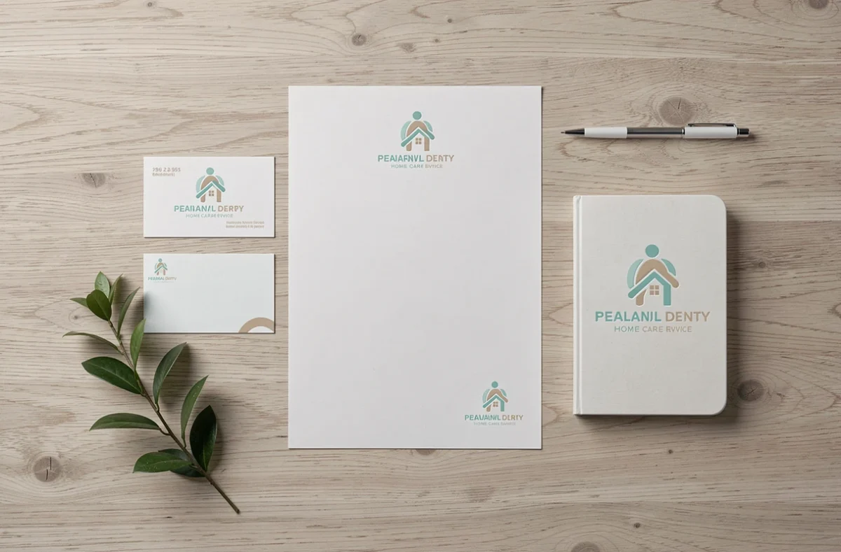
A personal services logo ends up printed on a blouse, embroidered on a polo, screen-printed on a utility vehicle, reduced to a favicon in a browser. The majority of uses occur off-screen, in conditions of degraded readability.
Recent recommendations for visual identity redesign (The First Blossom, September 2026) emphasize several control points that we deem non-negotiable for this sector:
- Verification of contrast in grayscale: the logo must remain identifiable in monochrome, especially for photocopied administrative documents or black and white prints of quotes
- Existence of three distinct versions: horizontal, vertical, and symbol only, each usable independently according to the medium
- Testing for small size reduction: a logo that is unreadable below 20 mm wide poses a problem on business cards, stamps, and email signatures
A design that works on a Retina screen but becomes a blurry spot on an embroidered t-shirt is a failure. We recommend designing in vector format (SVG or AI) from the start to ensure adaptability to all dimensions.
Colors and typography suitable for the personal services sector
The chromatic choice in personal services follows a precise sector grammar. Cool shades (blue, soft green) dominate because they convey calm and reliability to a clientele that is often vulnerable: elderly people, families seeking childcare, individuals with disabilities.
Saturated colors or combinations with high chromatic contrast are counterproductive. They evoke urgency or entertainment, not human support. A bright orange or intense red creates cognitive dissonance with the promise of care and serenity.
Regarding typography, the serif/sans-serif question deserves to be settled. For a personal services logo, a rounded sans-serif font (humanist type) combines readability and softness. Classic serif fonts work for premium positioned structures (concierge services, high-end home assistance) but weigh down readability on small digital materials.

Two typographic rules to follow: never use more than two font families in the logo, and check the rendering of each accented character. A poorly designed “é” in a free font destroys the credibility of a professional material.
Digital accessibility: a constraint that influences graphic design
Since June 28, 2025, the European Accessibility Act imposes digital accessibility obligations on companies exceeding the microenterprise threshold when they offer certain public services, including e-commerce. New services must be compliant from this date.
For a personal services company that offers online booking or scheduling management via a website, this regulation has a direct impact on the logo. The contrast ratio between the logo and its background must meet WCAG thresholds. A light gray logo on a white background, common in the sector, may pose a compliance issue.
We recommend systematically testing the logo on a white background, colored background, and dark background with a contrast checking tool. This step, often postponed to the end of the project, should occur as early as the prototyping phase.
Graphic symbols: what works and what has become generic
The personal services sector suffers from a saturation of symbols: outstretched hands, house roofs, intertwined silhouettes, stylized hearts. These pictograms no longer differentiate anyone.
An effective symbol for this sector serves two functions: it evokes the human connection without falling into cliché, and it remains identifiable once reduced to a profile icon on social networks or professional directories.
- Simple geometric shapes (circle, arc) combined with well-crafted typography surpass figurative pictograms in memorability
- A monogram built on the initials of the structure offers a unique identity without resorting to a worn sector symbol
- Mastered abstraction (a shape that suggests without literally representing) helps avoid visual association with a direct competitor
A logo without a figurative symbol can inspire more trust than a logo overloaded with pictograms. Graphic sobriety, in a sector where the trust relationship is the product sold, constitutes a real competitive advantage.
The last point to keep in mind: your logo will always coexist with the official SAP visual. Two complex graphic elements side by side create visual noise. The cleaner your logo, the more readable the whole remains on a constrained medium like a business card or a vehicle sign.